Home Screen Research & Feature Design
For this project, I would lead an exploration into what new features would be of the highest value to each stakeholder group, prioritize them, and design a flagship interface to house them.
*Due to an NDA certain details of my research findings are omitted or recreated to present this study.
NATIVE APP DESIGN
Tools: Figma, Jamboard, Maze, Useberry, JIRA
Challenge
Two years after releasing V1 of the Oshi app I had the opportunity and the data to design a home screen for the app. To do so I would need to:
- Determine what features would be of the highest value for our users to manage their care
- Identify what features would support our providers in delivering the most effective virtual care experience
- Design the IA required to deliver these features
- Create a new landing screen and UI providing these features
Results
Unfortunately, before reaching the testing phase this project was deprioritized and backlogged to shift resources to a new high-priority initiative. But during the three months spent working on this project my team and I learned a great deal, solved some really big problems, and made significant contributions to the company at large.
- The Home Screen features were identified and prioritized giving the project scope
- I found alignment across the care team and C-suite on a universal patient journey timeline and created deliverables outlining protocol for patient-provider interaction
- I formed a product-provider team to help create a dynamic care journey timeline
My Team
- Lead UX research & design (myself)
- Project manager
- Lead Registered Dietician
- Lead Health Coach
The Project
Context
When putting together the initial feature proposal and design for the app, developing a home screen was put on hold until the product team and I had enough data to determine what features beyond our MVP would best support patients and clinicians while navigating their care journey.
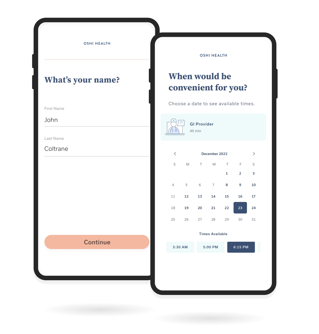
Instead, at launch the Appointment module functioned as the landing screen for the app, allowing users to manage and join appointments, and to access their visit summaries from completed appointments. This was chosen for the MVP landing screen because the features provided here were at the center of the patient journey.
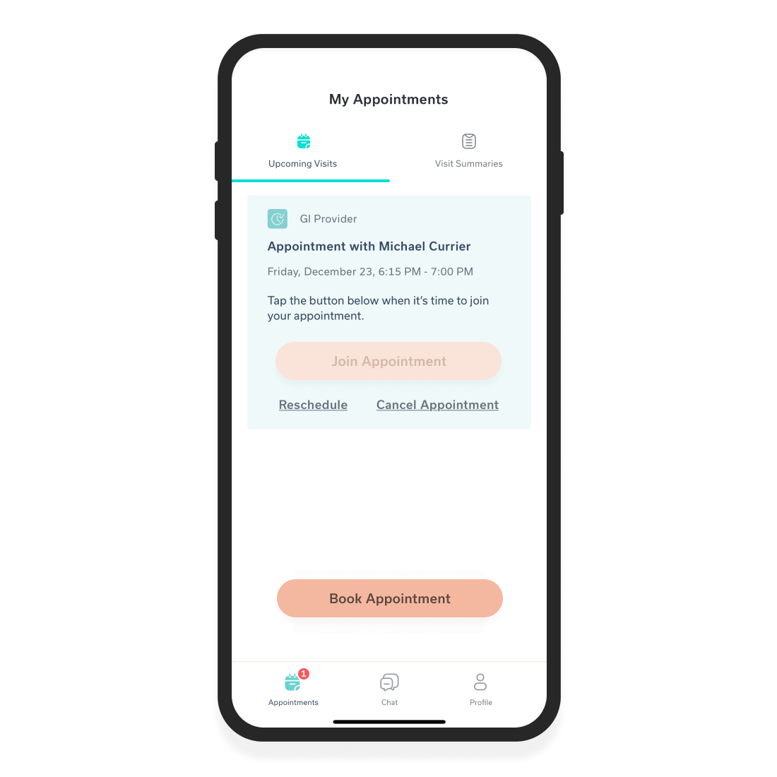
Appointment module as MVP landing screen
WHY NOW?
After about a year of operation, our clinical team had completed thousands of patient appointments and collected substantial data from each patient interaction, all of which was reviewed by the product team. At this time our growth department was also looking for a flagship app feature to help distinguish our tech alongside our approach to care, making this a logical point to pick this initiative back up.
DETERMINING WHAT WAS MOST NEEDED
To determine what features would deliver the highest value I needed an intimate understanding of how the care team interacted with our patients and what the care journey looked like.
Our CEO and growth team also had thoughts on what our product should aspire to be and I would need to understand these viewpoints as well.
Finally, our patients would certainly have an opinion about what was lacking in our experience and it was my job to discover what that might be.
To gather these insights I went on to complete the broadest round of stakeholder interviews I had yet to conduct.
Defining Scope
My first step was to identify the gatekeepers to the information needed and schedule scripted interviews with each of them.
MY KEY STAKEHOLDERS
After making inquiries I determined my primary stakeholders for this initiative to be the following groups and individuals:
- CEO
- Growth
- Partnerships
- Head of Product
- Registered Dieticians (2)
- Health Coaches (2)
- Lead Nurse Practitioner
- Lead GI Specialist
- Lead GI Psychologist
- Care Coordinators (2)
- Our Member Patients
Discovery
After reviewing my plans for research with my Project Manager I arranged the following sessions to begin fact-finding:
INTERNAL STAKEHOLDER INTERVIEWS
I conducted interviews with all internal stakeholder departments to learn about the features they would like to see included in the app and why. A lengthier series of interviews were conducted with each clinical tier group to learn more about their individual experiences and processes with the patient care journey and what features they believed would most improve patient outcomes.
Some of the desired outcomes for this feature were:
- A feature to support adherence to care plans
- A screen with a unique user interface delivering a wow factor
- A feature that speaks to and supports our multi-provider treatment model
DISCOVERING USER NEEDS
I organized and led a virtual roundtable with my product manager and members of our patient advisory board (a group of user study participants from our patient population) to learn about:
- Their frustrations seeking and receiving GI treatment (both at Oshi Health and in past experiences)
- Pain points or perceived feature gaps within the Oshi Health app
- Any difficulties they have experienced remaining adherent to their care plan
Key takeaways from this session were that our users wanted:
- The ability to follow their progress during treatment
- A way to conveniently access and manage dietary and other self-management tools shared by providers (they were currently receiving links to articles from our providers via email)
- General transparency on their progress and plans for treatment
- To know when they can expect to see symptom improvement and eventually remission
FINDING ALIGNMENT AMONG KEY STAKEHOLDERS
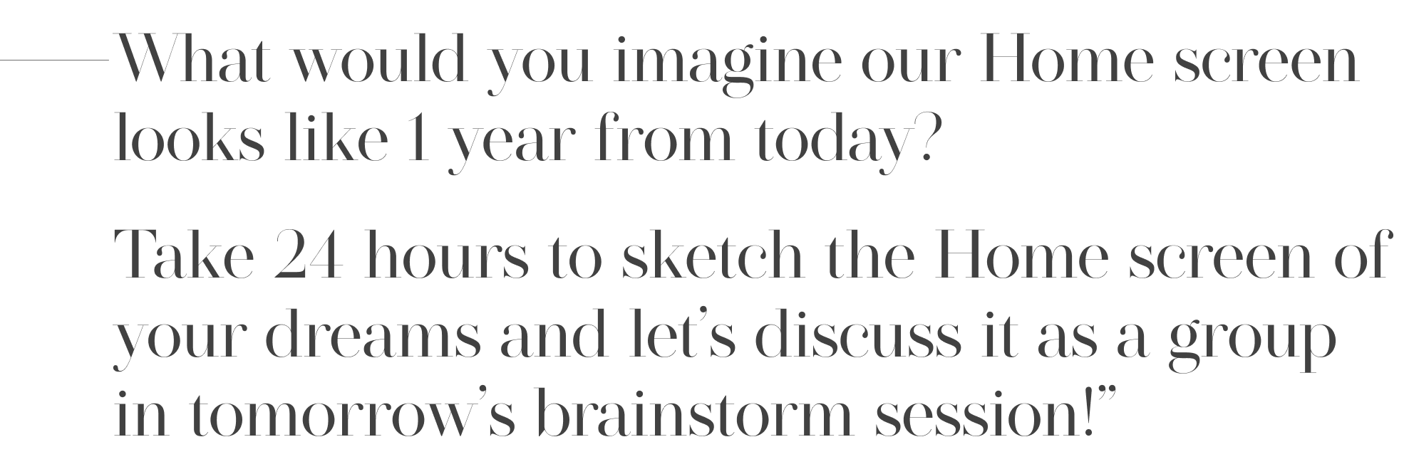
Looking to build alignment among internal stakeholders I prepared a design exercise and coordinated a follow-up session with each stakeholder group participating.
The design exercise asked each participant to take 24 hours to sketch what they imagine our home screen should look like a year from today.
The following day I conducted a virtual brainstorming session using Jamboard to walk through each design as a group and discuss the functionality they represented.
After the session, I held a vote with all internal stakeholders to create a priority list of all the features proposed. This was incredibly helpful in building alignment across departments and helped to get the company behind a singular vision for the future of our product.
Definition
THE HOME SCREEN FEATURE LIST
With a wealth of data collected from all stakeholders, I reviewed the feedback from the patient roundtable and mapped their reported needs with the proposed features from the company brainstorm session. After reviewing the analysis results with the product team two functions aligned well with both Oshi Health's business and clinical needs as well as reported user needs.
I determined that the home screen would:
- Provide patients information on where they are in their care journey, and
- Share supporting materials for successful self-management and improved treatment adherence
CREATING A TEAM TO TACKLE THE OSHI CARE JOURNEY TIMELINE
At the time of this project, there was no internal alignment on how we might construct or visualize a universal treatment model for our program.
To create a high-level timeline for the Oshi Health care journey that could be applied to all member patients I needed the help of the provider departments responsible for the lion's share of treatment management: our Nurse Practitioners, Health Coaches, and Registered Dieticians.
I coordinated a team to help visualize a timeline accounting for care across all our treatment verticals that included:
- Myself
- Project Manager
- Lead Health Coach
- Lead Registered Dietician
- Lead Nurse Practitioner
PRODUCTIZATION TEAMWORK
We held weekly workshops to begin the 'Productization of the Care Journey' and complete the following:
- Lay out the treatment journey into a timeline
- Break the timeline into phases
- Identify user pain points & desires at each phase
- Determine what treatment methods or features we can provide to patients to address these pain points
- Brainstorm & wireframe concepts on how to visualize personalized patient journey timelines on a mobile device
Together we were able to create a three-phase model for the care journey accounting for all clinical groups of the Oshi Health care team:
- Nurse Practitioners
- Health Coaches
- Registered Dieticians
- GI Providers
- Psychologists
The three phases segment the patient journey into the significant stages of the care journey.
PHASE 1: Diagnosis by HCP, which leads to a treatment decision
PHASE 2: Treatment, monitoring progress, and providing access to care
PHASE 3: Adherence, compliance to therapy, and chronic management
Milestones for each phase were documented along with the corresponding providers. The (self-reported and observed) patient's state of mind and pain points were documented at each stage of the phase.
This gave the Productization Team and me a point of reference to identify information from our provider's toolkits and/or progress data that would be effective in alleviating pain points and improving treatment adherence.

An example of documentation outlining the home screen care journey timeline simplified to protect confidential information
Once internal alignment was found on the documentation for the care journey visualization and functionality the final iteration was shared witht he clinical team for buy in.
Iteration
To learn how other digital health tools may have approached the problem I conducted an audit of home screens by interacting with dozens of health and wellness products. I also conducted research into timeline UI best practices for both mobile and desktop home screen experiences.
DESIGN EXPLORATION
Working on a long-term project like this one requiring novel UI gave me an opportunity to step away from the constraints of the current Design System and build a concept for the Oshi Health 3.0 experience.
I began by sketching concepts for an interactive timeline on a mobile device approaching the problem with both vertical and horizontal layouts attempting to make the best use of screen real estate prioritizing an intuitive experience. Beginning with rough sketches always helps me to identify questions and quickly validate concepts for a deeper exploration.
I had learned from my research and previous projects that only a small fraction of our patient population found value in graphs and other deep dive data tables and rather preferred screens listing key trends and data points. Because of this, I chose to focus on a design that could be easily scanned for this kind of information. I planned to construct a 'deep dive' screen concept to be accessed from the Home screen but would move on to this after my primary project goals.

I experimented with ways to highlight key aspects of the progression through Oshi Health's user journey, prioritizing tasks and milestones related to the present and near future.
After speaking with patients I believed a timeline extending to projected milestones and a time of remission could serve as effective motivation and a tool for understanding trends in their symptoms.
I also wanted to reduce friction while consuming provider-shared content and completing tasks like food and symptom tracking by including access to all of these features.
Early concepts were shared with the Productization Team and after feedback, I began to move on to wireframing components.
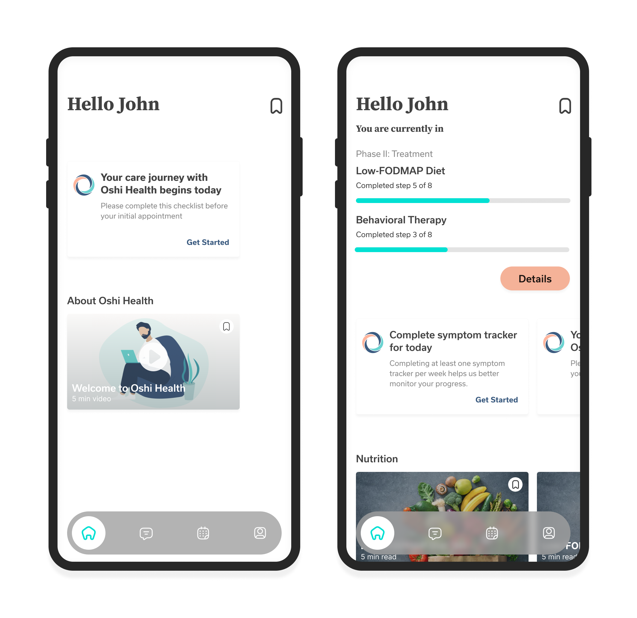
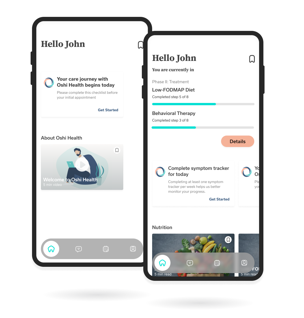
From left to right: Home Screen concept of initial state after downloading; Home Screen concept after diagnosis and being assigned a care team
KICKING OFF DESIGN
While working on wireframes I kept the following high-level goals in mind:
- Improve adherence to prescribed treatments
- Provide a place to view and manage all content shared by their care team
- Deliver greater transparency on patient treatment progress
- Increase app engagement in frequency and duration with a useful and delightful user experience
I created several concepts for home screen layouts with different component visualizations for:
- A personalized greeting
- A clear description of where they are in their care journey
- To-do lists for completing important tasks
- Access to curated knowledge-base content
WHAT I HAVE LEARNED & WHAT I STILL NEEDED TO DISCOVER
In my initial iterations for the home screen, I explored ways to present users with a screen unifying their care plan across providers, provide clarity into where their care journey is headed, and give them tools to improve adherence to their prescribed treatments.
To accomplish this I worked on developing the IA and design of several concept components. Below are a few examples that were prototyped for user testing.
COMPONENT CONCEPTS
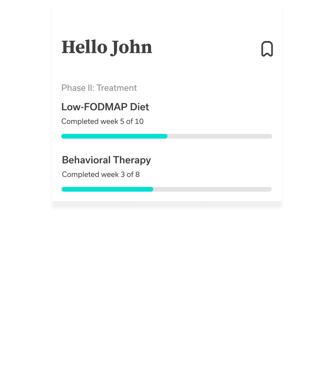
Reasons to include Progress Component:
- Helps to visualize a time when symptom management will be achieved
- Acts as a reminder for date-sensitive tasks related to treatment
- Timelines have a positive effect on treatment adherence
Open questions to validate design:
- How helpful is the progress bar vs. the text description?
- What if any additional information might the user want to see?
- Is this top of mind enough to warrant being on the home screen or should this be moved to a deep dive screen?
- Would a deep dive screen even be useful or is this progress information sufficient?

Reasoning for including To-do Cards:
- Bring CTA for patient tasks into the app experience as opposed to email and notifications, as requested by patients
- Keep all important tasks in one place for reference
Open questions to validate design:
- How many To-do tasks should a patient receive/expect to complete each week?
- How/when are To-do cards dismissed?
- Should completed tasks be editable? Archived for patient viewing?
- How much text is the right amount?
- Do cards need a 'New' signifier?
- How personalized can/should we make these messages? Where do we draw the line between what should be a To-do card vs. a Chat message?
Reasons to include Content Cards:
- Content from our knowledge base is used to educate our patients on a variety of Oshi's treatment; this would give them a place to collect, manage, and save it all vs. email or chat message
- General wellness content from our knowledge base could be provided in full to all patients
Open questions to validate design:
How often can users expect to receive content from their providers?
Does it matter to users/providers who sent each article?Are there any other management features users expect to have besides bookmarking?
Do content categories make sense or should all content be delivered in one feed and be distinguished another way?
What is the engineering lift required to include a search feature? At what point, if at all, would this be useful to users?
Conclusion & Learnings
AN ABRUPT END TO THE HOME SCREEN PROJECT
Unfortunately, after around three months of steady progress, the Home screen project was deprioritized and backlogged to shift resources to support the acquisition of three new partners. This was naturally disappointing to everyone on our team who had grown invested in seeing the project through to at least a prototype. However, despite the end of this project, the work my team and I completed led to alignment and deliverables that would be invaluable to the company far beyond its initial scope.
PROJECT RESULTS & WHAT I LEARNED
The Productization Team I created for research on the home screen was continued by my successor and has been successful in solving this and several other cross-team alignment issues. The care journey timeline with milestones, pain points, and solutions I created has remained in use by the product, growth, and clinical teams.
I also personally took away a lot from this project. I learned what it takes to foster collaboration, find alignment, and work with C-suite and knowledge leaders.
I had the opportunity to get to know the roles outside of the product team in detail, including their pain points and wishes for the product, giving me a much greater perspective as UX Lead. I learned how to build and manage content in a knowledge base, increased my understanding of HCM integration, and really enjoyed the opportunity to just be creative without constraints, which I had not done in months.
I learned that although I love the feeling of satisfaction that comes with shipping a product after testing and development, I feel most excited and at home going from 0 to 1 in the discovery and early iteration part of the product cycle.
Oshi Health & My Role In UXWork Experience
Rebranding & Design LibraryWork History
Sign-up Flow & AcquisitionWork History
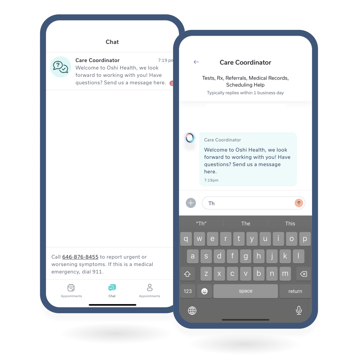
Chat MessagingChat Messagin
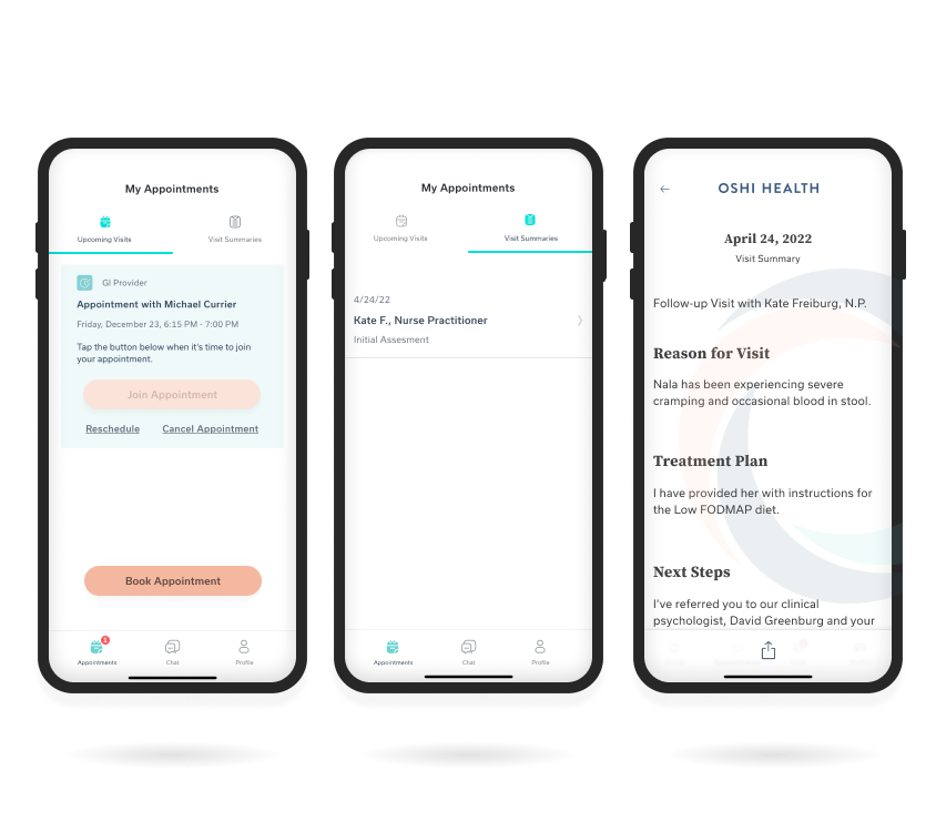
Visit History FeatureWork History
Copyright © 2024 Claude Grant