Oshi Health Rebranding & Design Library
After a company pivot and restructuring, and with the support of the clinical and partnerships departments, I led a rebranding project to find the voice and face of the new Oshi Health.
*Due to an NDA certain details of my research findings are omitted or recreated to present this study.
DESIGN LIBRARY CREATION & BRAND DESIGN
Tools: Adobe Illustrator, Figma, Survey Monkey, JIRA
Challenge
Ensure we were pursuing the appropriate brand image and voice for Oshi Health's relaunch as a virtual GI clinic and build the foundation for a growing entity by creating a style guide, brand voice guidelines, and developing the company's first design library.
Results
I led the creation of a logo, brand tone guidelines, a design system, and UI elements that are still in use today.
The Team
- Lead UX Research & Design (myself)
- Freelance Branding Consultant
- Content Manager
- Product Manager
The Project
Research
What do we want our branding to convey? What do patients living with GI issues or suffering from symptoms expect from their health solution? These were the questions I began with and to find the answers conducted applied the following research methods:
- A brainstorming session with members of the Product, Partnerships, and Content departments to discuss what we believed our strengths as a brand were and which of these would best apply to our mission.
A sample deliverable resulting from our initial branding brainstorm session
- Organizing paid survey testing with participants within our target market's parameters to gauge perceived reactions to the current branding: company name, logo mark, and color palette from people with no prior knowledge of Oshi Health.
- As we were then new to the virtual clinic industry, research was done to familiarize ourselves with our competitors' approaches to branding and language; downloading apps, going through the sign-up processes, and occasionally receiving treatment.
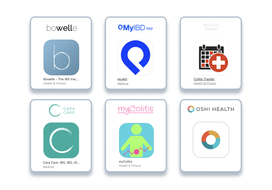
Oshi Health's legacy branding in comparison to other patient facing GI health apps

Oshi Health's legacy branding in comparison to other virtual clinics
Iteration
The findings from all research activities were shared with a freelance designer who was tasked with updating our brand mark, color palette, logo, and brand font. I created a timeline for periodic design, review, and feedback of iterations until myself and members of the Product team believed we had a selection of viable options.
Testing
The strongest design options, tone, and language derived from our in-house brainstorm were then tested individually on a group of our current users, as well as participants unfamiliar with our company to learn their preferences and reasoning why. The findings were used to inform a final round of iteration.
Legacy Logo
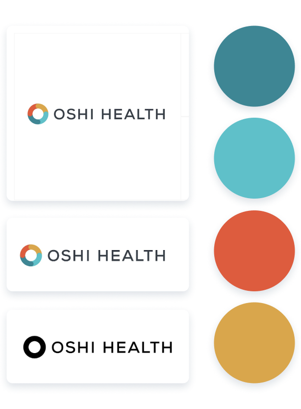
Logo A
Logo B
Preferred brand tones derived from testing results, original logo tested against preferred logo design options
Findings & Final Design
Testing results showed that our legacy logo and font suggested an electronics manufacturer to the majority of participants without prior knowledge of Oshi.
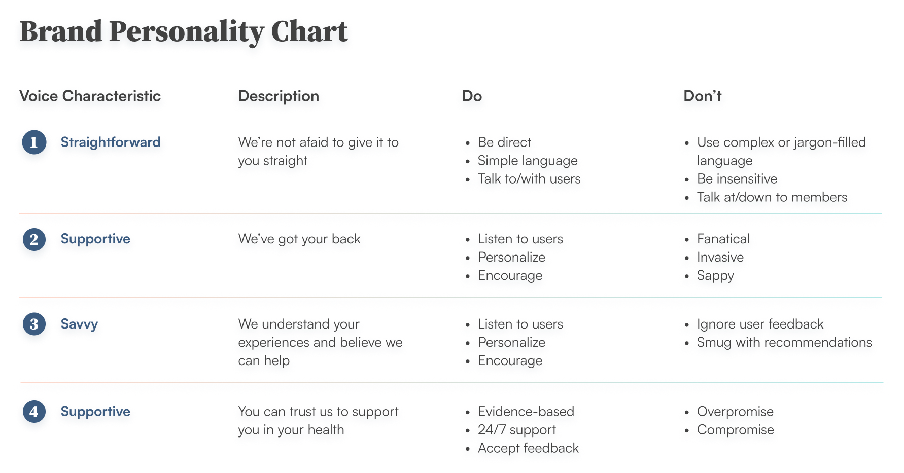
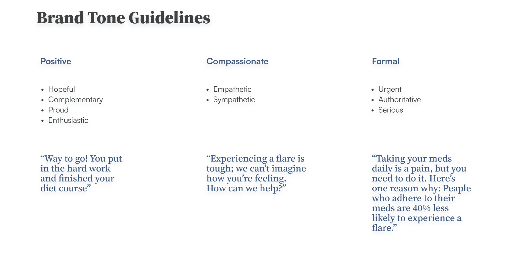
Brand Tone: participants preferred a tone that was sympathetic but not saccharine; supportive and confident.
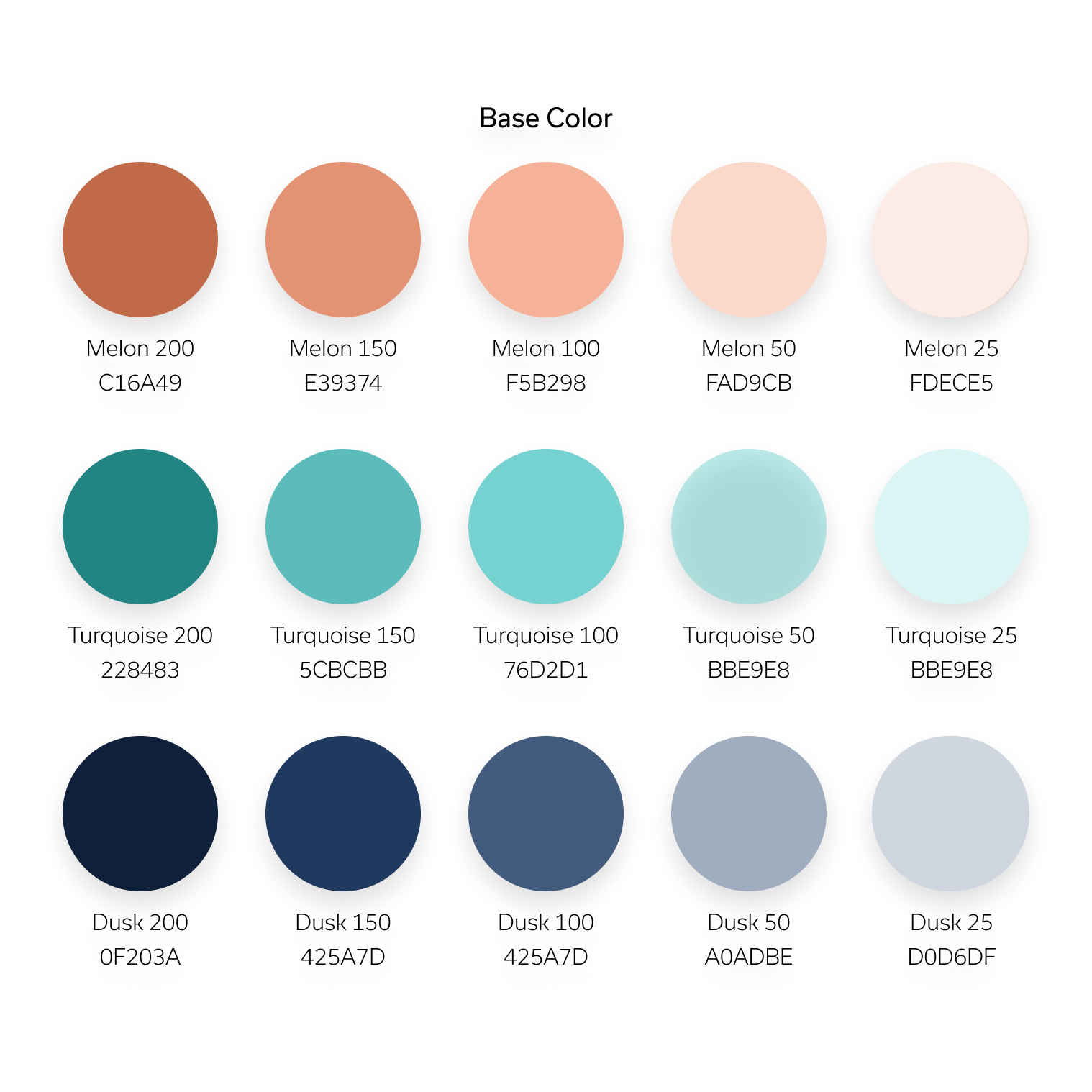
Color Palette: blue tones tested well invoking feelings of reliability and confidence. We chose to combine this with shades of green a neutral tone that conveyed optimism and nurturing.
Imagery: in order of preference, participants preferred custom photography and abstract illustration to stock photography.
The results from our rounds of testing led us to a solution requiring a final round of iteration. After the final design was approved by the Product team, the results were shared with our CEO for his final approval.
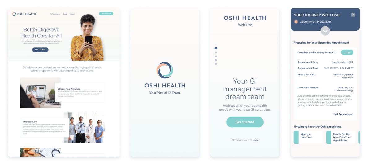
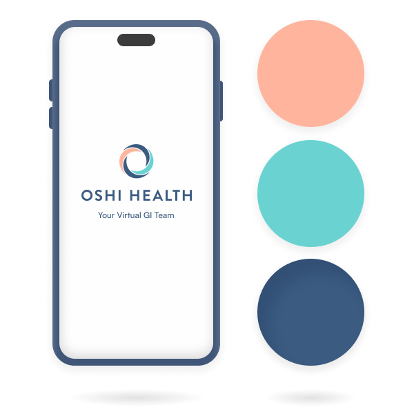
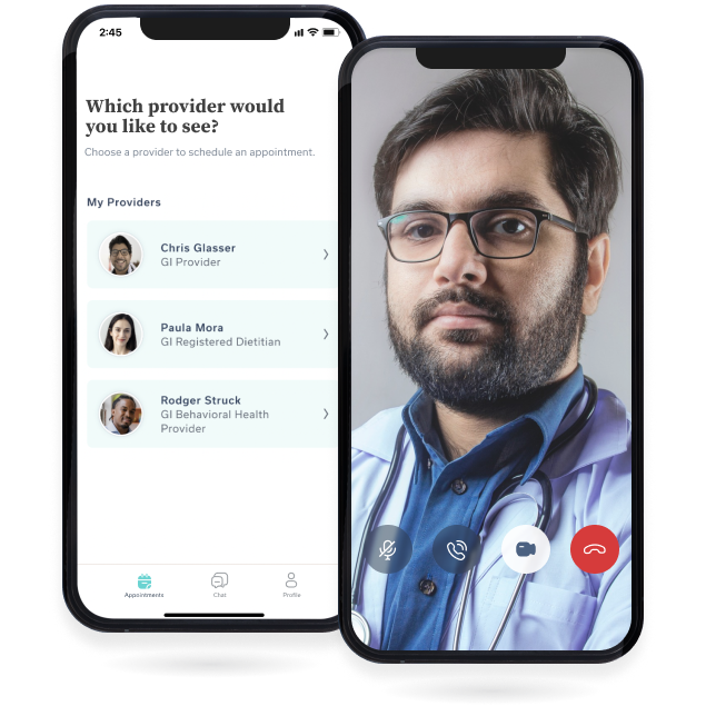
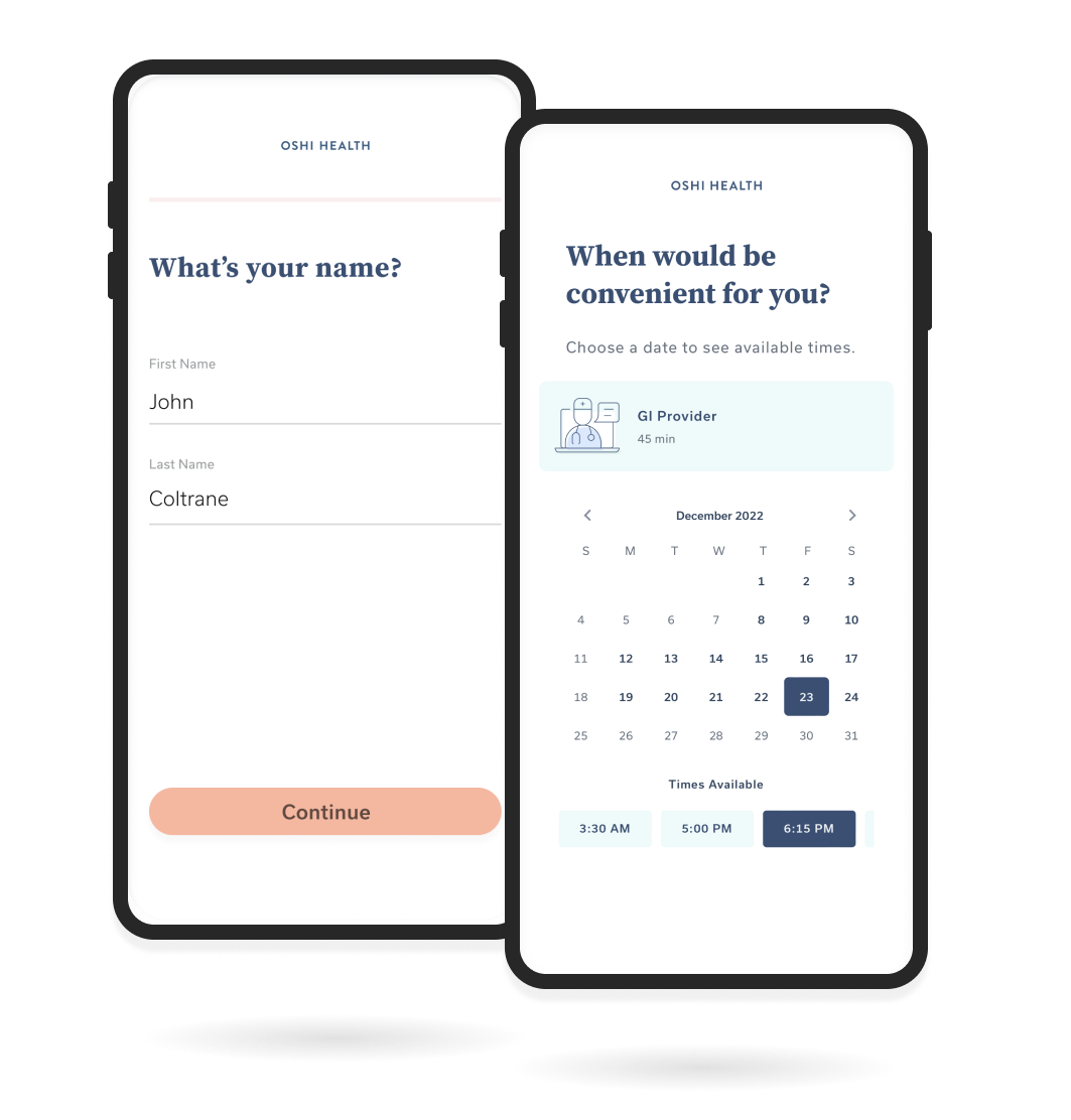
Sample images for website, app loader, landing screen, and pre-visit screen
Implementation
Once updates were signed off on by stakeholders I began to use our new primary color palette to develop a secondary palette and select a new font and font hierarchy for use in the app and the web. At this point, the MVP app for Oshi Health was in its earliest stages of development, therefore the design system was developed as we progressed toward our completion date for the app.
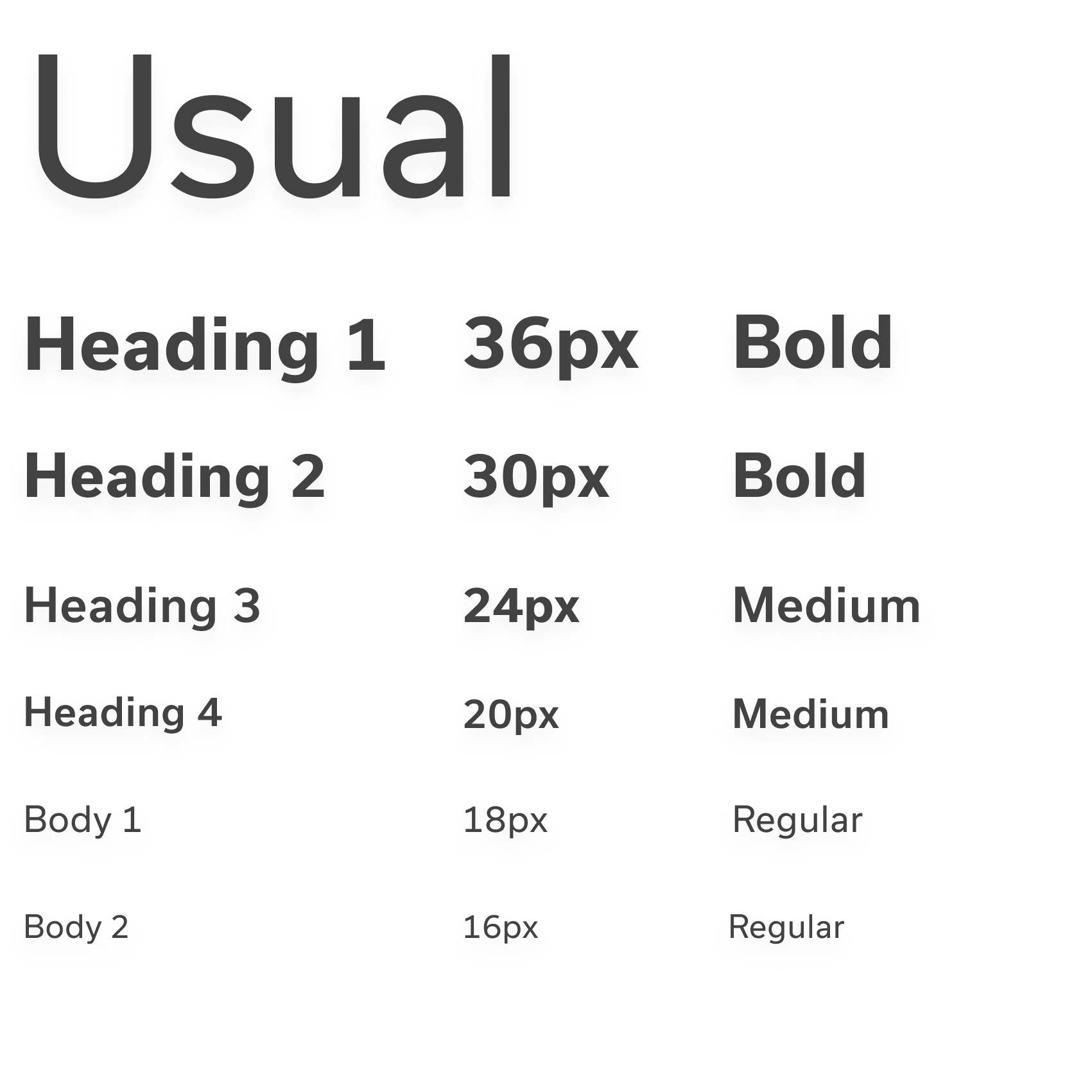
The sans-serif font family Usual was selected for primary use due to its readability, perceived neutrality, and professionalism. Using the primary palette I built out the extended color palette, and a secondary palette, assigning their usage cases (Ex: Error Messaging).
Elements of the design library
A style guide was created with examples of the phrasing and tone of voice expected from our patient-facing materials as well as samples of image and illustration styles, subject matter, and their use cases.
Alongside work on the app, I also worked with the sales team to identify and prioritize assets for updating and redesign using our new brand elements, including B2B presentation decks; business cards, booth banners, and other printed materials.
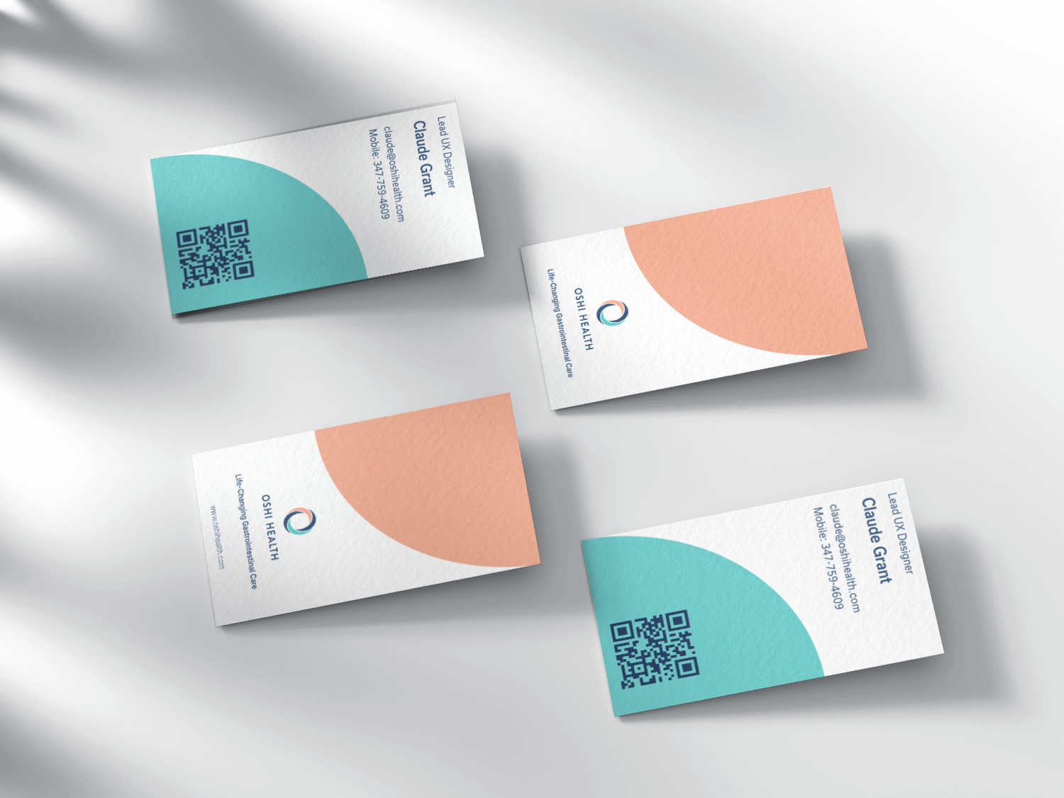
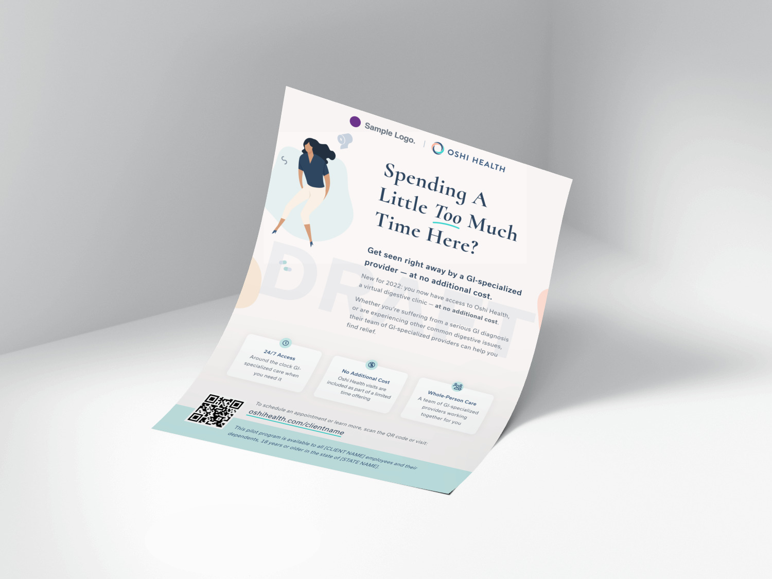
Business card redesign & sample partnership flyer design
Subsequent Updates
As the development of the app progressed I created a component library in the design system for frequently used UI elements such as buttons, cards, and navigation bars.
Oshi Health & My Role In UXWork Experience
Sign-up Flow & AcquisitionWork History
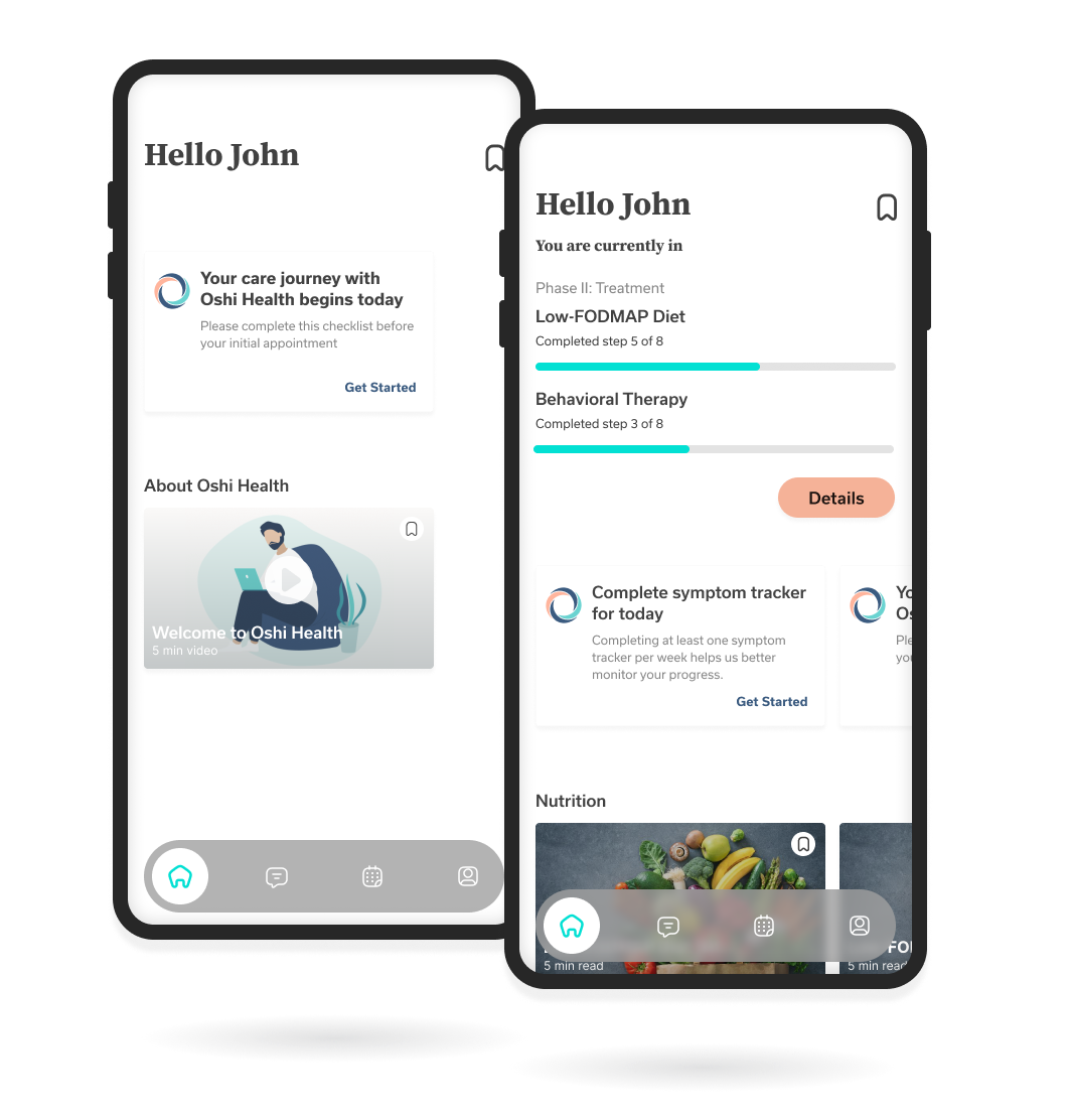
Home Screen Research & DesignWork History
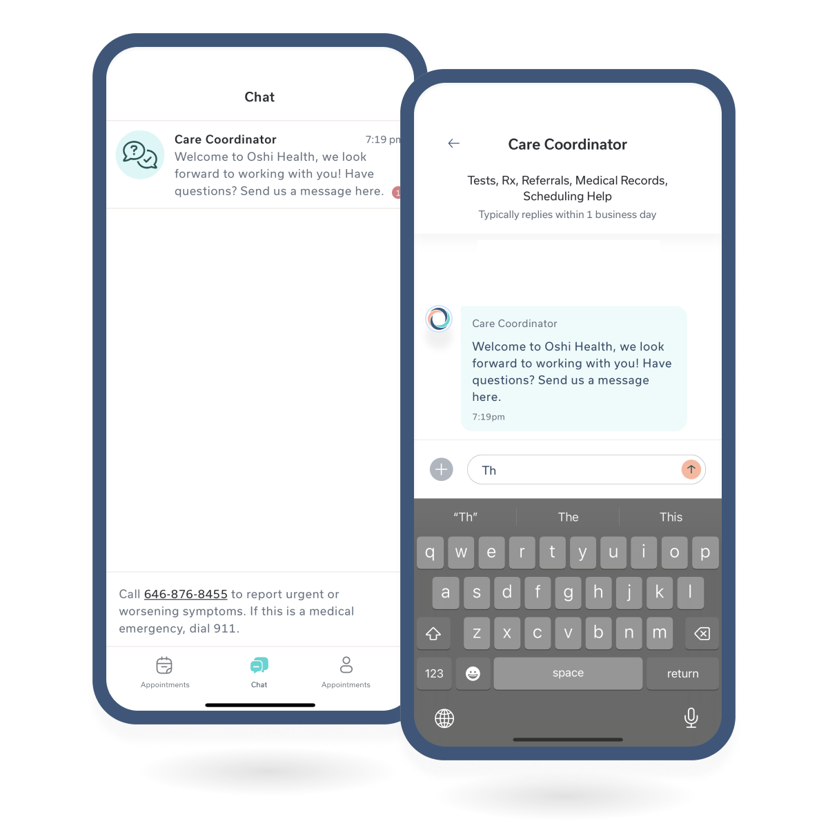
Chat MessagingChat Messagin
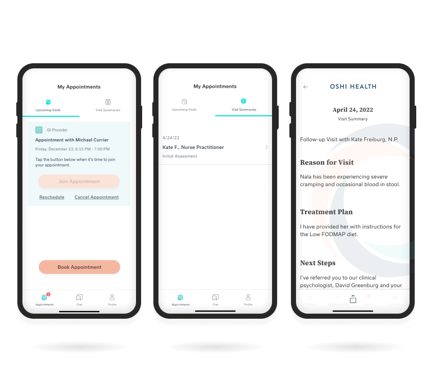
Visit History FeatureWork History
Copyright © 2024 Claude Grant