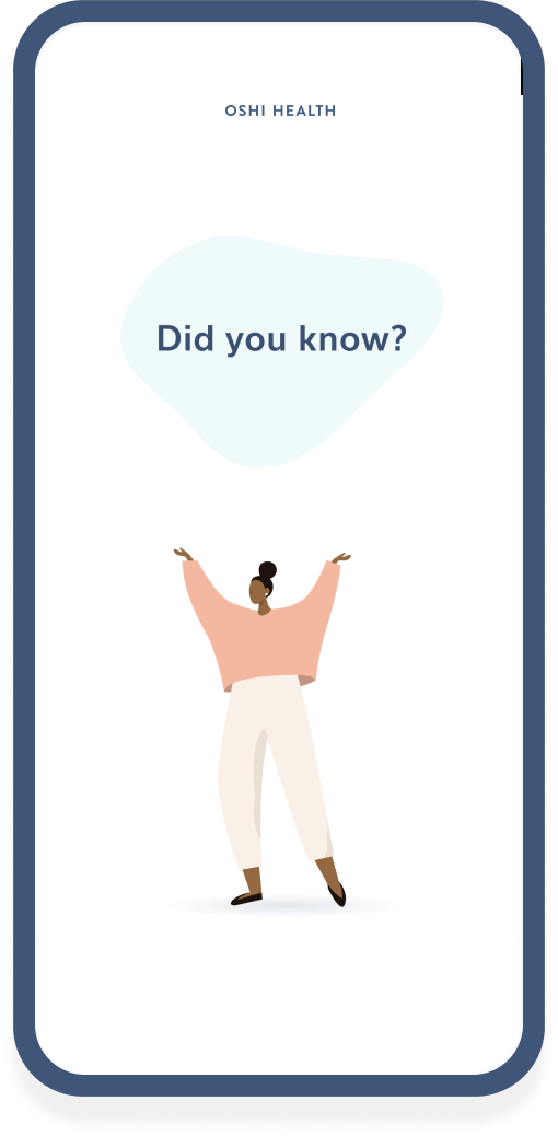
Sign-up Flow
Arguably the most crucial aspect of a successful user experience, I led the research, testing, design, and subsequent updates to the member sign-up flow for Oshi Health.
*Due to an NDA certain details of my research findings are omitted or recreated to present this study.
MOBILE & DESKTOP WEB DESIGN
Tools: Figma, Maze, Useberry, JIRA
Challenge
My first feature design project for Oshi Health was to create a sign-up flow meeting product, clinical, and legal requirements using best practices for a low-friction experience. At this time I had just completed a rebranding effort and there were no restrictions to hinder iteration, but no precedents to aid in the process. Therefore the iterative process was also an exploration of component design for the app and an opportunity to lay precedent in what the look and feel of the experience would be.
Results
- Through subsequent updates based on funnel data, we were able to achieve a conversion rate of approximately 30%
- The foundation of the sign-up flow remains in use today
My Team
- Lead UX research & design (myself)
- Project manager
- Front & backend developers
The Project
Defining the Scope
To start to define the scope I considered the stakeholders of the project and their respective goals.
Users
I want to create an account to begin receiving care as quickly and friction-free as possible.
Clinical Team
I want to receive answers to all questions required to schedule their initial appointment and provide care.
Legal Team
We need to state all policies and document acceptance of all terms and conditions.
Product Team
We want to create a sign-up flow indicative of the Oshi Health experience that can be adapted as our acquisition model changes and matures.

About The Oshi User
Before beginning this project user personas were created after surveying over 200 men and women and interviewing approximately 40 living with a chronic GI condition. Potential users were segmented into five arch types based on where they were in their disease journey and their symptom severity.
Some of the high-level characteristics of the Oshi user are:
- 18 - 65 years of age
- Predominantly female
- Employed full-time
- Familiar with medical terminology and treatment
- Previously diagnosed with a chronic GI illness and / or dealing with chronic GI symptoms
- Often frustrated by previous negative experiences with physicians, missed events, failed treatments, and costly tests and medications
My Research
To guide my initial iteration research included but was not limited to:
- Reviewing current best practices for sign-up flows and questionnaires
- Cataloging and completing the flows of brick-and-mortar clinic intake questionnaires, the sign-up flows of competing virtual clinic apps, as well as apps with the highest-rated sign-up experiences regardless of industry
- Conducting interviews with our clinical and legal teams to determine their must-haves and nice-to-haves for the sign-up questionnaire
Findings
Stakeholder interviews led to the following insights and requests which were synthesized and used to create a list of feature requirements and a few nice-to-haves.
USER RESEARCH TAKEAWAYS
- Sign-up should be as brief as possible
- Skeptical of new treatments and services promising better results
- The need for a solution keeps them open-minded
- Experienced in healthcare sign-up and health tech solutions
- Ability to choose the doctor's sex is important
- Often have to wait over 2 weeks or more to see a specialist or report to an urgent care facility when experiencing symptoms, the opportunity to have an appointment within 48 hours is the strongest incentive to complete sign-up
CLINICAL TEAM INTERVIEWS
- Contact info and physical address required
- Encourage users to schedule an initial appointment in the first interaction
- Diagnosis collection
- Info on any current symptoms
- Complete registration and medical history prior to appointment
- Receive current provider info and medical records

LEGAL TEAM INTERVIEW
- Disclaimers for collecting contact information
- Terms and Conditions
- Privacy Policy
- Informed Consent
- Assignment of Benefits
- Notice of Privacy Practice
PRODUCT RESEARCH
- Collect contact info upfront for resoliciting
- One-thing per page format
- Progress indicators
- Value prop messaging during sign-up process

Hypothesis & Iteration
I began iteration by writing copy for the questions each stakeholder wished to include in the flow, looking to the Brand Tone guidelines created during my rebranding work to achieve a personal, friendly, and credible voice. I also considered the following to convert a user to a subscriber/member:
Legibility / Scanability
My initial thought was to apply the one-thing-per-page approach to our questionnaire. This would leave screen space for any necessary supporting copy without causing cognitive overload.
Credibility
Add supporting copy for more sensitive questions explaining why we are asking and how the information will be managed.
Time To Complete
Add a progress bar animation for transparency.
Accessibility / Inclusivity
Testing was completed on UI elements to ensure concepts were accessibility compliant. I proposed including optional gender and pronoun inputs to supplement the required legal sex question. This would help our clinical team to address our members appropriately.
Low-fidelity wireframes were then created exploring these UI concepts to be A/B tested for user preferences.
Testing
Virtual testing was conducted individually with 15 participants identifying as people living with a chronic GI illness and meeting the target criteria of our members. Responses to the questions and the order in which they were presented were compared to determine feelings towards the length of the sign-up, the language used as well as multiple field inputs vs a one-question per page format.
Testing methods included:
- A/B Testing to determine preferences for error handling UI elements and questionnaire formatting with the number of questions per screen
- Card Sorting used as an interactive tool to order preferences for answering questions such as providing a home address, and diagnostic information
- User Scenarios to test preferred language tone and questionnaire length
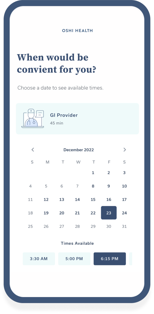
Final Design
Rounds of user testing and interviews led to clear preferences among users and product team members alike, such as a one-question per page format and supporting copy explaining the collection of phone numbers and the inclusion of gender information.
I designed a custom transition animation for the questionnaire and created detailed spec documentation to support the engineering team during development.
Findings were used to create a final design with the following features:
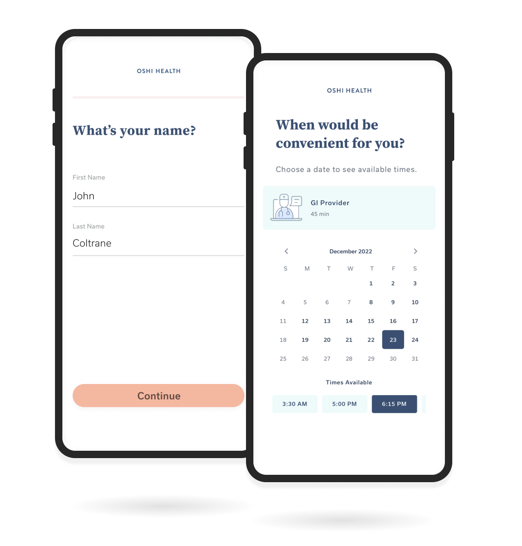
- Responsive webapp design
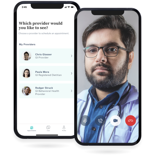
- Schedule their first appointment after account creation
- Supporting copy explaining the collection of contact info
- A personal tone to questions asked
- Value prop messaging
- Two-question max per page format
- CTA to download the app


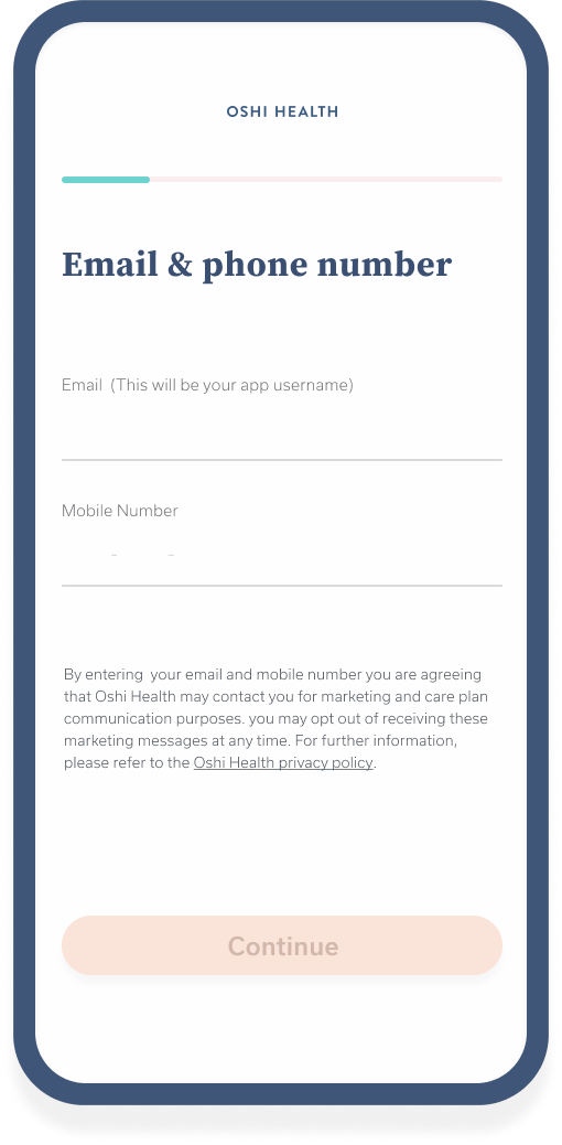


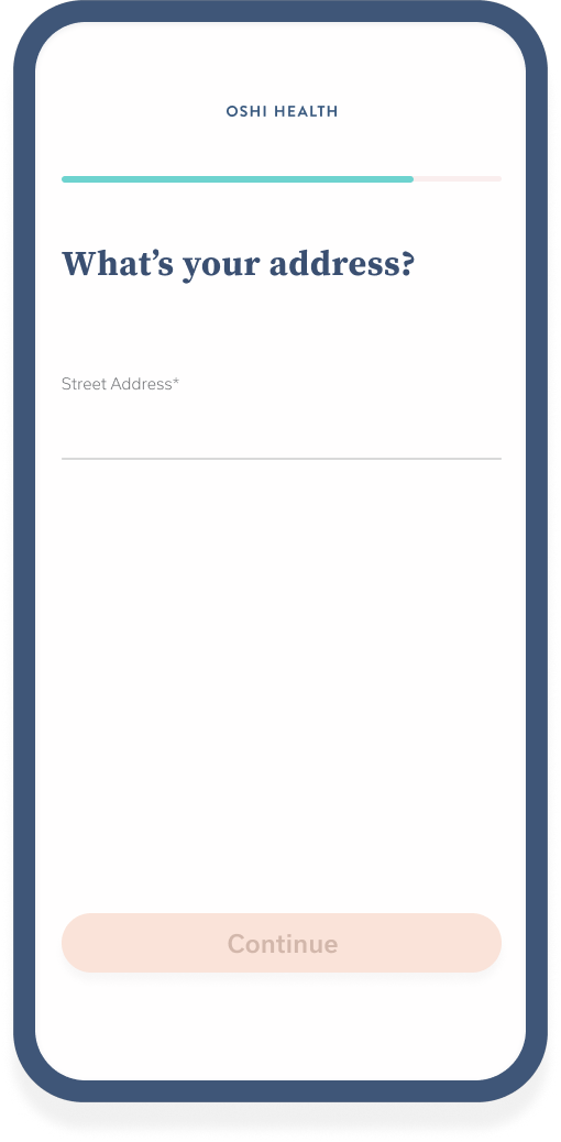


Sign-up flow on mobile

Sign-up screens on desktop/tablet
Handoff
As this was the initial handoff of a design project with a newly formed product team a formal process hadn't yet been established. This allowed me to get to know my engineering counterparts, how they worked, and how best to support them in realizing the designs I created. Clear and open communication would be key during the process, as questions arose and roadblocks emerged, however, my handoff process included the following:
- Sharing Figma file with clickable prototype, hi-fidelity wires, and a spec doc for a selection of devices.
- A design brief with keynotes and links to the Figma file and all other supporting documents
Subsequent Updates
As requirements changed and we received more data regarding user progression through the sign-up flow, updates were periodically made to increase the completion percentage rate.
- A paywall was later included allowing for monthly subscriptions to Oshi Health services before this direct-to-consumer program was subsequently discontinued. I conducted research on payment processing vendors before recommending Stripe to management, and creating designs and copy for the additional screens needed. For transparency, pricing was displayed at the beginning of the flow, and the collection of credit card information occurred after scheduling the first appointment.
A QR code was added to the desktop flow to link to the respective App or Google Play Store to download the app.
An input field to include symptoms and discussion points for a provider to review before your appointment was added to the appointment confirmation screen.
- The inputs for email & phone number were later combined to remove one screen from the flow.
- Funnel data was reviewed to identify friction points leading to a regrouping of questions and re-ordering of the question sequence improving the completion rate by 13%.
Areas For Improvement
I would have liked to see the follow-up intake form brought into the app experience as I had initially planned. This part of the sign-up flow was deprioritized due to engineering bandwidth in favor of an e-form presented to patients via e-mail following completion of the sign-up flow.

Wireframes for backlogged in-app intake form
Once the user downloads and signs into the app, the intake questionnaire could be presented to them in a low-friction format and submitted directly into the EMR, removing additional steps for both the patient and our care team.
Oshi Health & My Role In UXWork Experience
Rebranding & Design LibraryWork History
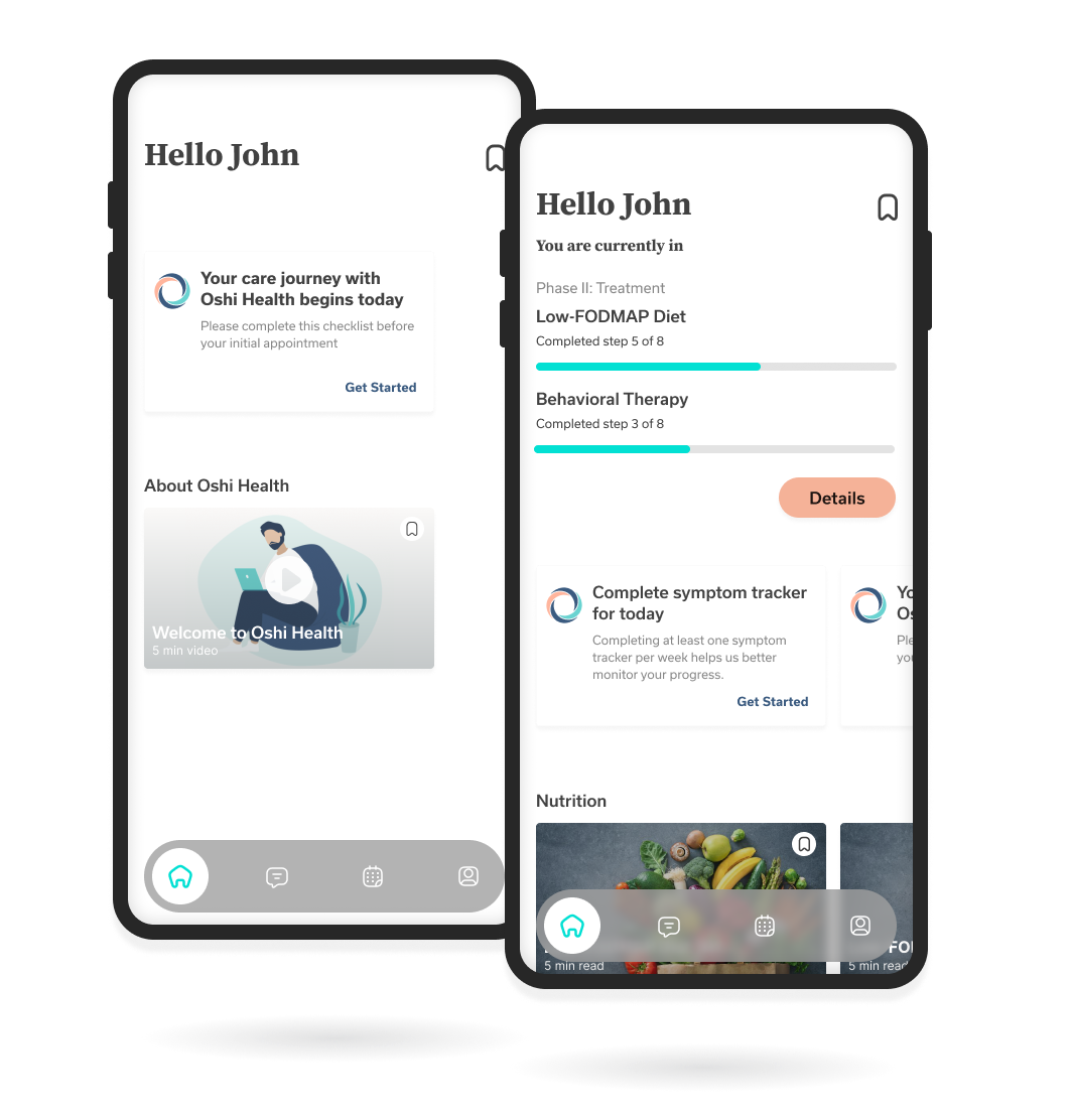
Home Screen Research & DesignWork History
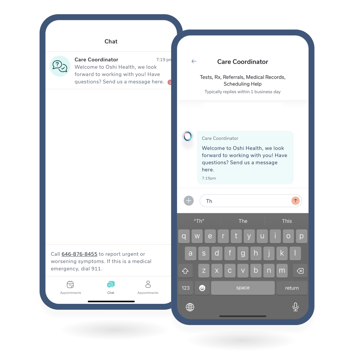
Chat MessagingChat Messagin
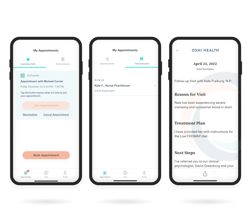
Visit History FeatureWork History
Copyright © 2024 Claude Grant