Oshi Health & My Role In UX
To give context to the case studies outlined in my portfolio it may be helpful to give a brief introduction to Oshi Health and a summary of my four-year experience in UX Design at a digital health disruptor.
Company Overview
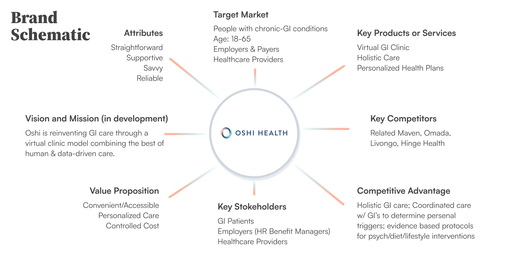
Oshi Health is a B2B2C health solution designed to treat people with chronic gastrointestinal illnesses. Oshi Health is a virtual GI clinic that offers its members a whole-person approach to symptom management incorporating GI oversight with health coaches, registered dietitians, and clinical psychologists. This care team works together to identify triggers and behaviors that lead to symptom flares to diagnose and prescribe treatments, ultimately helping patients find remission. Oshi Health's model has not only proven successful in treating GI illnesses, such as Crohn's and Ulcerative Colitis but has helped members achieve disease control in record time.
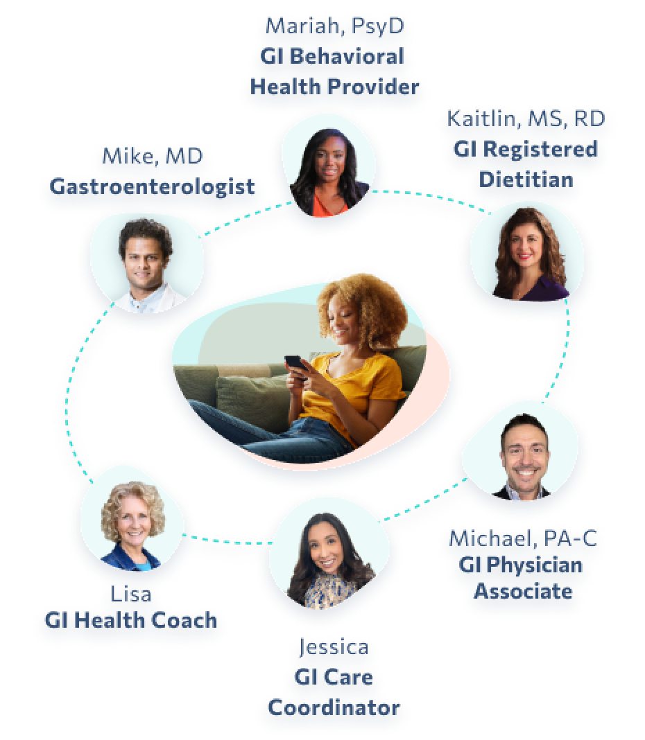
Example of the care team available to members through the app
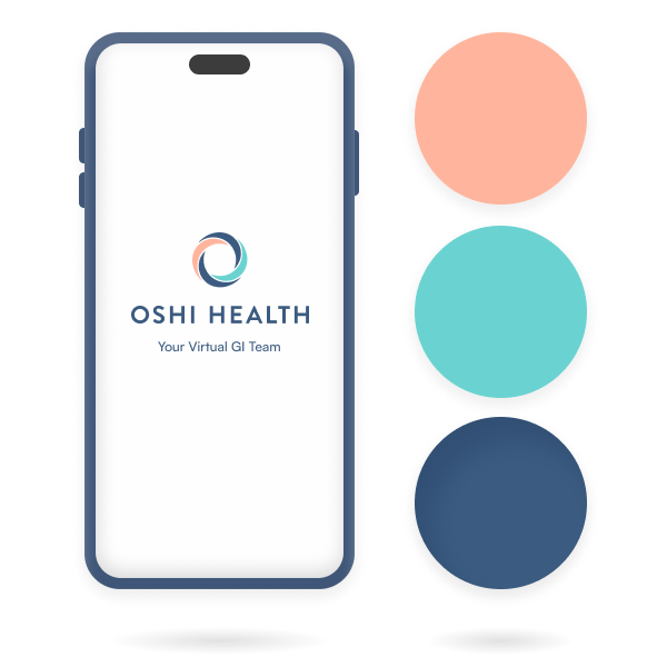
Oshi (1.0)
When I joined Oshi Health during its first year of business the initial JS React app served as a tool to help users track and measure their GI symptoms to uncover hidden patterns in behavior that may lead to flares.
Challenge
My role after joining the team was to apply UX practice to legacy app designs and complete research on users and life with GI diagnoses to determine how to add value to the app experience.
The Team
- CEO
- Project manager
- UX designers (2 including myself)
- Social media manager
- Partnerships manager
- Accounting
- Business development
- Front & back end developers (Ukraine)
Research & Problem Solving
I conducted in-depth research on Chron's Disease and Ulcerative Colitis and the lives of those living with them. My counterpart and I sorted through social media groups and partnered with the Chron's and Colitis Foundation to find participants for an all-day seminar with our entire staff. We conducted a round table as well as smaller group exercises to share an understanding of the day-to-day challenges of living with these conditions.
To understand and solve our low engagement problem I conducted a UX review of the app. After a dozen interviews with people with digestive issues I concluded that a GI symptom-tracking app was of low value to this community, and what they needed was an app providing a support community and treatment. Shortly after this (but independent of my findings) the company pivoted to do just that, and it has been exciting and incredibly rewarding to help Oshi Health accomplish this new goal.
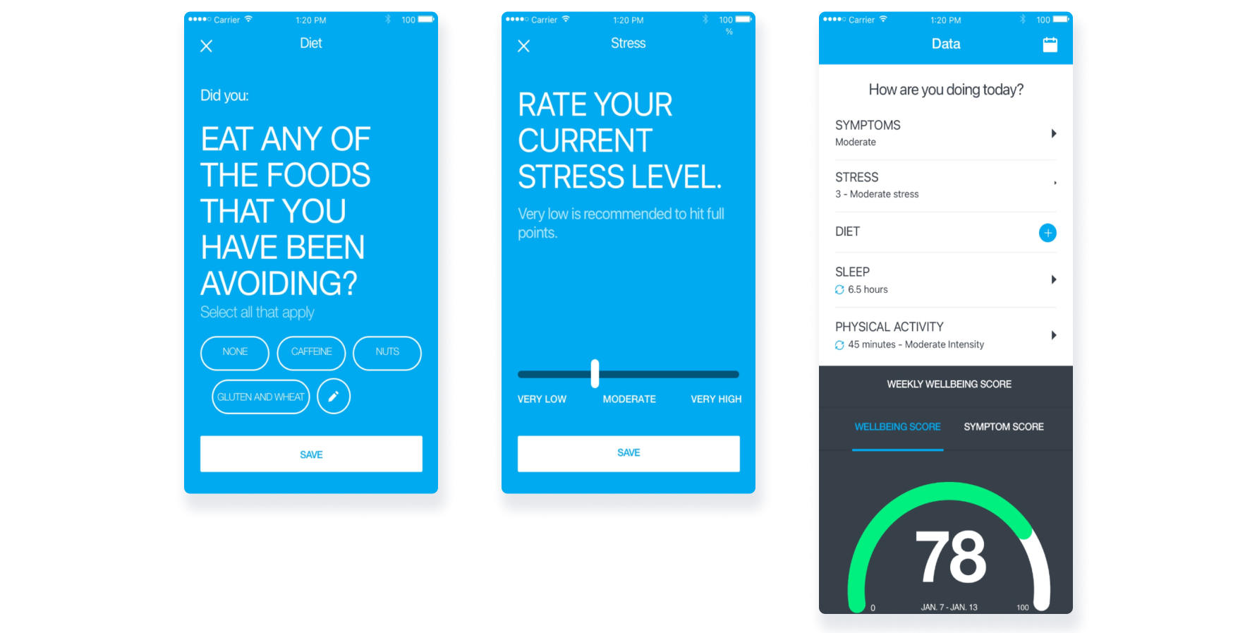
Input screens from legacy Oshi Health symptom tracker app, results summary screen
Oshi Health (2.0)
Challenge
After the company pivoted, Oshi Health was rebranded as a virtual GI clinic and would need a site and app to acquire patients and support care delivery.
The New Team
- CEO
- Head of Product
- Project managers (2)
- UX Lead (myself)
- UX designers (2)
- Partnerships manager
- Accounting
- Business development
- HR manager
- Clinical team (from 3 - 20+)
- Front & back end developers (4)
Quantitative & Qualitative Research
I and my UX counterparts conducted interviews with over 40 individuals and surveyed over 200 others living with one or more of the diagnoses we prepared to treat. We learned about their pain points, the days missed from work, family gatherings, and other meaningful events affected by symptom flares. The interviews were recorded and findings were shared with the entire company.
Before the company established the clinical team that would drive our business, the product team and I led an extensive research initiative into the chronic diagnoses we were likely to encounter: reading and cataloging data on symptoms, comorbidities, available treatments, cost of care and recovery periods, which helped the growth team to build a roadmap for what treatments we would offer as we grew into a full-service clinic. All of this research not only led to a deeper understanding of the company's mission but also a deep feeling of empathy for those we would treat.
Rebranding
Aside from research, I reevaluated the look and feel of the company branding. I partnered with a freelance branding designer to develop a palette and trademark based on our original design but softer and more welcoming. After testing options for typefaces, colors, and language developed our style guide, brand guidelines, and design library.
An MVP pilot program was released to test our treatment model and product to learn and improve before the official relaunch as a full-function GI clinic. By analyzing member feedback we identified and improved issues related to how members join appointment calls, receive their treatment plans, and approach their providers with questions.
Results-Based Processes
The product team implemented weekly reviews of analytical data to monitor performance trends and inform what updates would be prioritized. Quantitative data gave us metrics we would use to set our KPIs and measure their success.
Major Design Initiatives
While at Oshi Health I oversaw and periodically designed and conducted user testing scenarios for both new and existing features, researched and designed sign-up flows, paywalls, messaging features, video call interfaces, a knowledge base, home screen, and a majority of the UI features used in the app and company site.

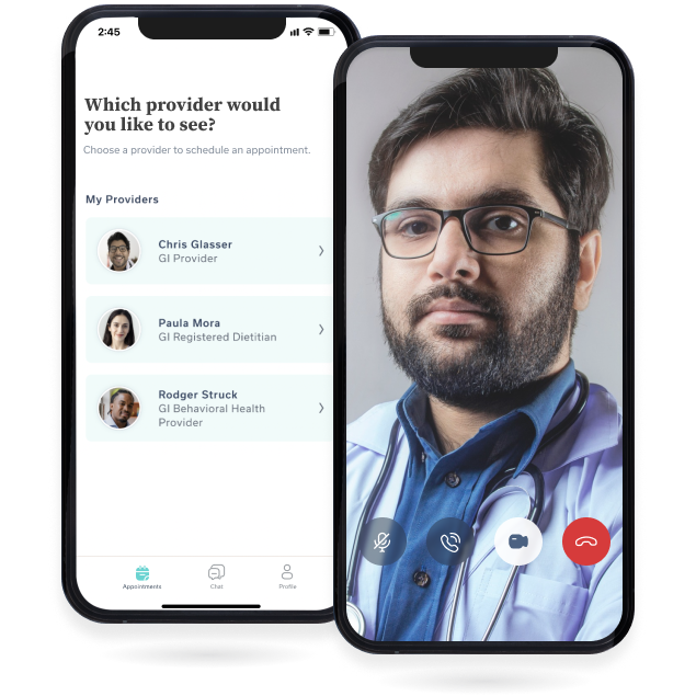
Sample screens for video call, appointment calendar, and the chat feature
Rebranding & Design LibraryWork History
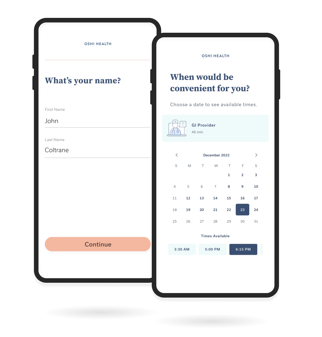
Sign-up Flow & AcquisitionWork History
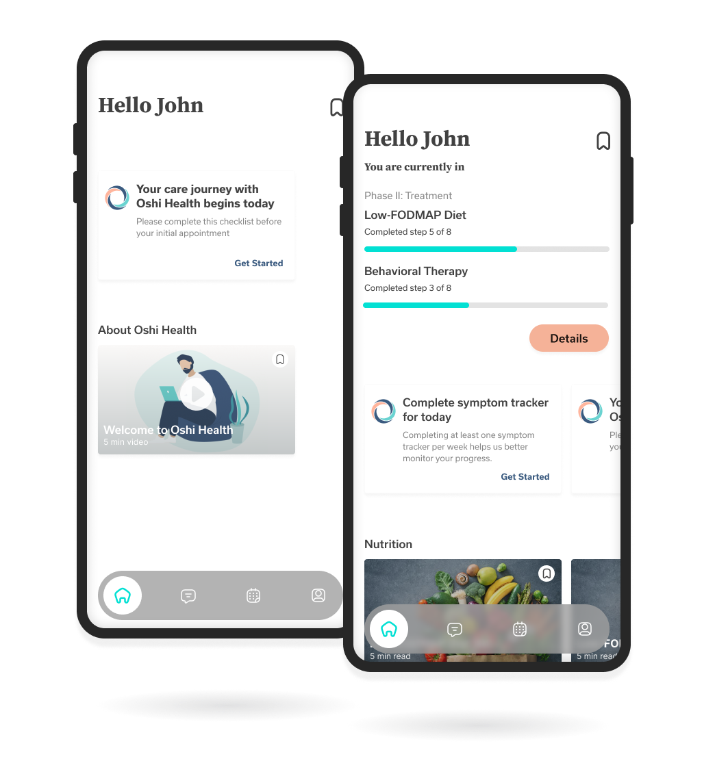
Home Screen Research & DesignWork History
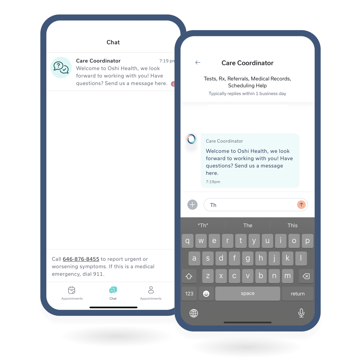
Chat MessagingChat Messagin
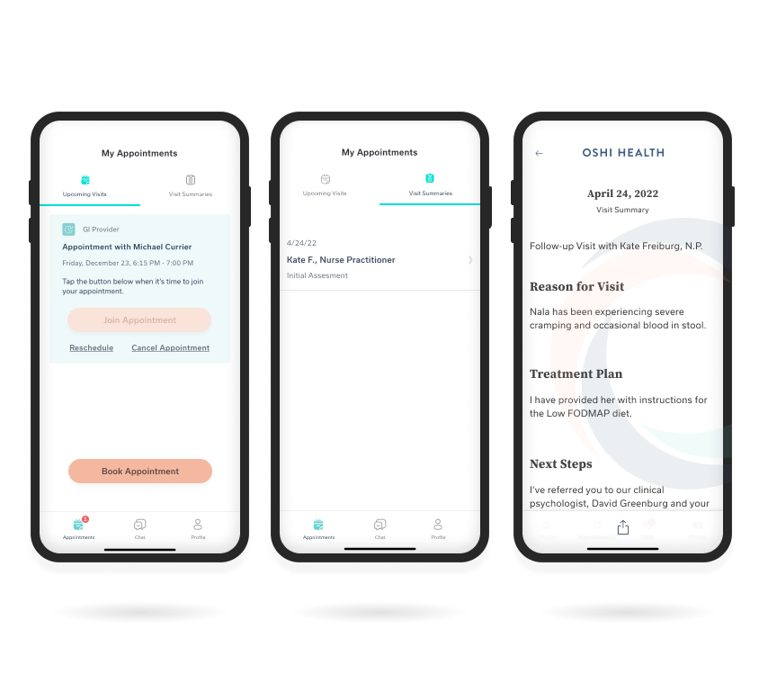
Visit History FeatureWork History
Copyright © 2024 Claude Grant