Visit Summary & History
I led the design of the first post-MVP feature to view and share summaries of completed visits and treatment plans through the app.
*Due to an NDA certain details of my research findings are omitted or recreated to present this study.
NATIVE MOBILE DESIGN
Tools: Figma, Useberry, JIRA
Challenge
Following the release and subsequent update of our MVP app I reviewed the list of backlogged features to determine what the next most valuable feature would be to design and develop.
Based on stakeholder feedback and engineering bandwidth I chose to add a feature to the app's existing architecture providing:
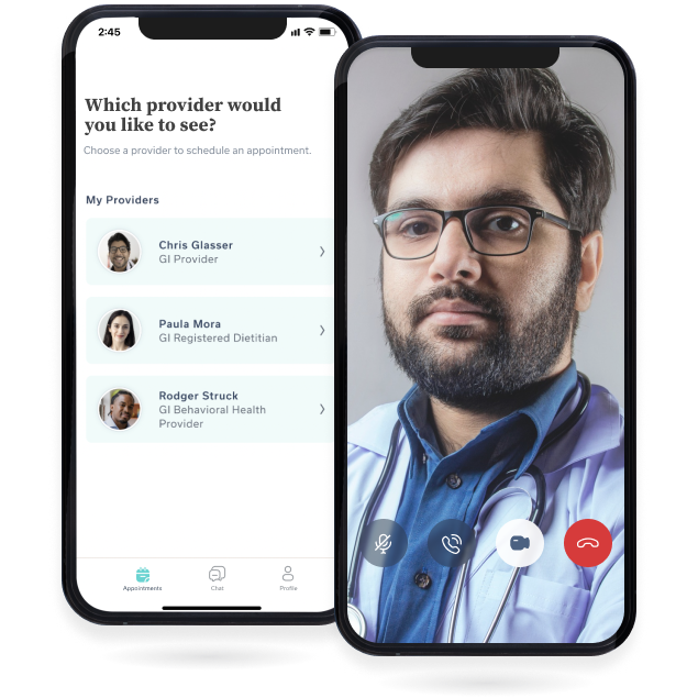
- A method for providers to share a written copy of treatment plans with patients
- Our members with the ability to easily find and review their Oshi Health visit summaries
Results
- Clinicians reported an improvement in adherence to treatment plans
- Improved CSAT scores
- 6% increase in daily active users
The Team
- Lead UX (myself)
- Project Manager
- Front & Back-end developer
The Project
Research
When taking on this project I had a very limited understanding of our medical records system and how it may be integrated with our app. The research I conducted included:
- Interviews with our clinical team members to discuss how they currently share treatment plans with our patients
- Requesting a tutorial on how the medical records software functioned from a member of our provider team
- Interviews with 6 members of our patient advisory board to hear their pain points and desires regarding how they receive records from their providers, and how they would ideally imagine their post-visit experience to be
- Reviewing how both brick-and-mortar and competing virtual clinics provide treatment plans to their patients
- Sharing key findings with the lead engineer to discuss possibilities for developing an integrated feature optimized for patient experience
Synthesis
At this time our clinical team created a record of each appointment in our Athena medical records database, exported it in its entirety, and emailed it to the patient within 2 days of a completed appointment. These exports would include internal system language, medical jargon, and other notes that didn't pertain to the visit or the treatment plan. Patient feedback showed that the poor formatting decreased the value of the document in their eyes due to lack of readability. Patients also needed to search through their email and/or print out summaries to review their prescribed treatment plans or share notes with an outside provider.
Athena software was chosen for its integration capabilities, but no one on our team before now had researched what was involved in the process or how much flexibility we would have in customizing this feature. I worked with the lead engineer to explore our options.
Priorities for the integration of visit summaries were to:
- Minimize load times in the app
- Select what data fields were shared in patient-facing versions to make them as clear and legible to the patient as possible
- Provide options for patients to share, download, and print
- Include as much of our brand styling as possible for a seamless user experience
Design
I found the two most logical options where to include this feature in the existing IA would be either in the patient/user profile pane or the appointment pane. However, after listing out the features stakeholders would like to include, such as notifications for new visit summaries, I decided the user profile screen was not a prominent enough location. In any case, a low-fidelity clickable prototype was created for both options to test my hypothesis.
After reviewing the current Visit Summary layout I discussed streamlining the content with the clinical team and agreed that its efficacy could be improved by trimming the information fields to:
- Date of service
- Provider seen
- Reason for visit
- Treatment plan
- Next steps (i.e. any follow-up appointments or referrals)
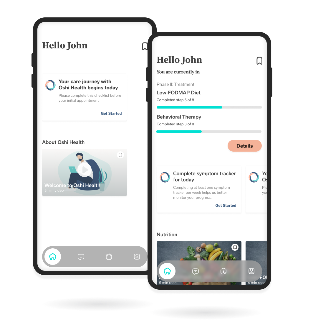
For the visit history list screen, I wanted to account for read and unread states of the visit summary, as well as what information would be of the highest value to users when scanning their visit history.
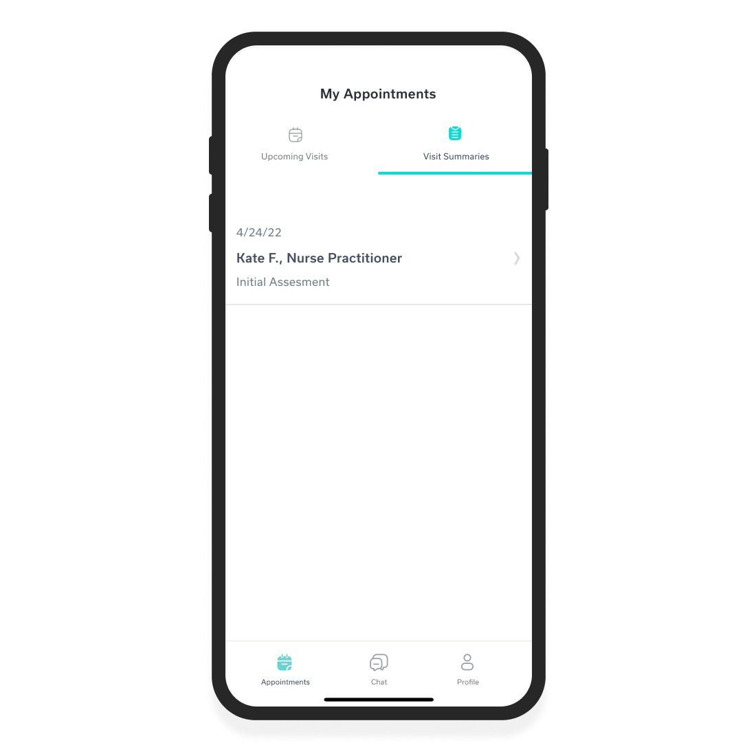
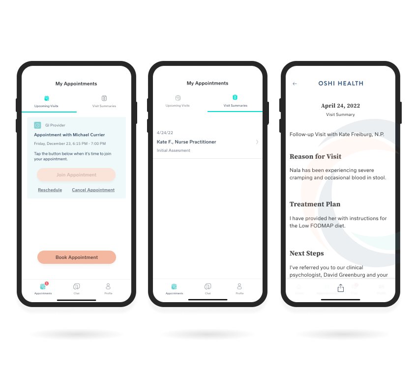
Visit Summaries screen, with a new tab feature to view upcoming appointments or summaries of previous appointments, in date order with provider and visit type
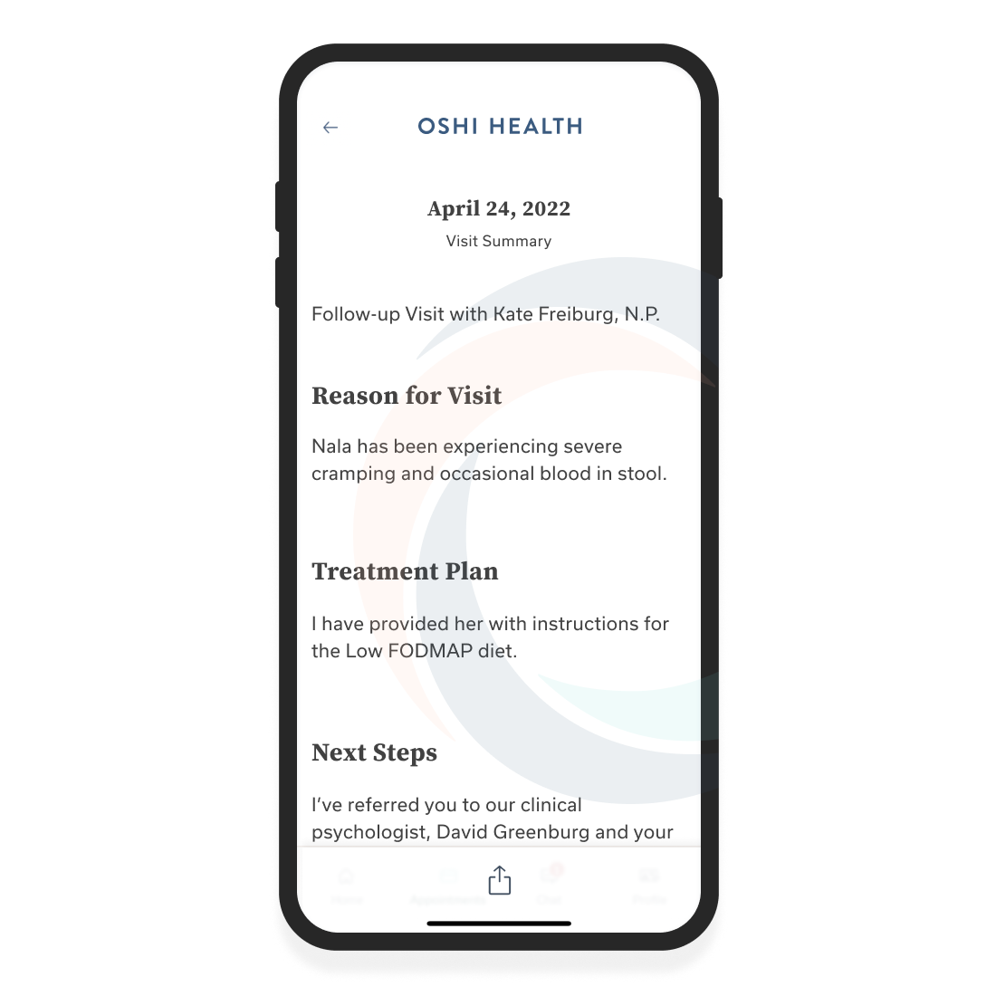
Sample Visit Summary with fixed header and share button footer to launch native share options
Any Testing Is Better Than None At All
Due to time constraints for handing off to the engineers for an upcoming release, designing and conducting a formal testing scenario was not possible. To test my design decisions I presented 8 members of the Oshi Health team with an A/B test for navigating to the Visit Summaries. I also surveyed to determine the clarity of UI designs such as:
- Read vs Unread Signifiers
- Notification System
- UI for sharing, exporting, or printing the Visit Summary
Once a consensus was found for all designs final updates were made and spec documents were created to hand off to the lead engineer for development.
Development & Feature Launch
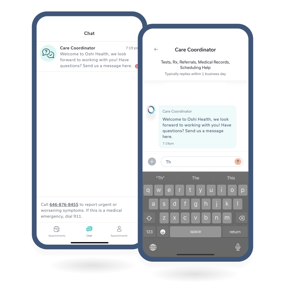
I worked with the lead engineer to split the Appointments pane feature into Upcoming and Previous Visit Summaries with a tab interface. We repurposed the new/unread badging system I designed for our Chat feature to indicate new/unread Visit Summaries. Our clinical team believed that patients referring to their visit summaries was important to successfully maintaining treatment plans so I wanted to convey a sense of urgency to review them when delivered via the app.
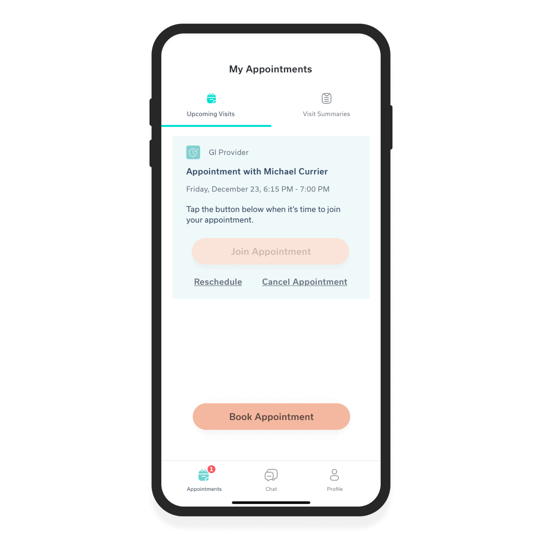
Upcoming Visit tab with badges on Appointments navigation icon and Visit Summaries tab to indicate the number of new / unread summaries available
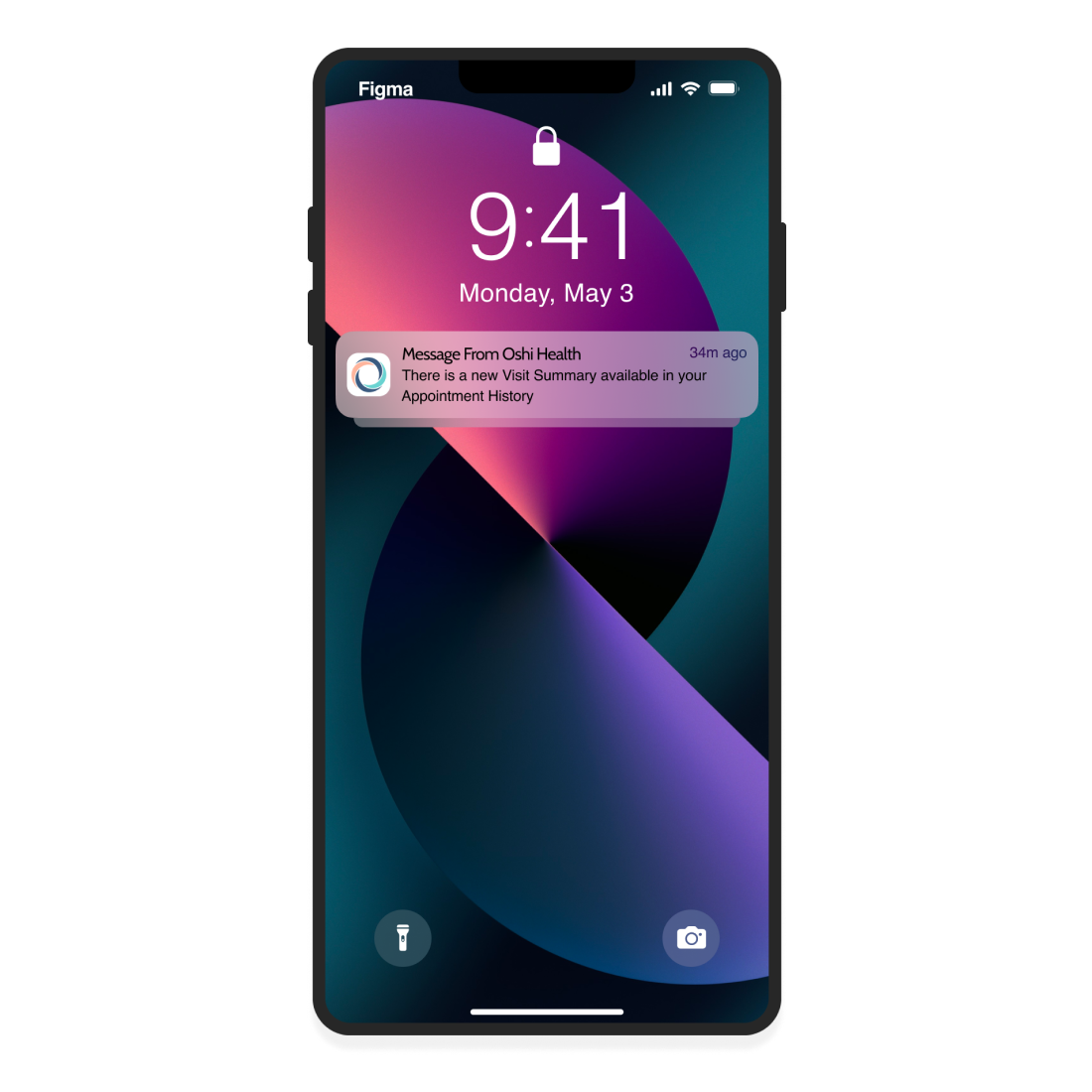
Push notification indicates when a new summary has been received; push notification directs the user to the Appointments pane
Unfortunately, my design for a one-time overlay to introduce users to this feature update was scrapped due to time and engineering constraints. Instead, after the new release our clinical team urged members (vocally during visits and by email) to download the update and find their Visit Summaries here going forward.
Areas For Improvement
I believe the Visit Summaries could be improved by adding deep linking to the documents rather than remaining static. For example, providing links to information about prescribed diets, new diagnoses, medication, etc. would be helpful to users and remove steps. Ideally, the Visit Summary would include deep links to a glossary and/or content in our knowledge base that could all be viewed within the app.
Oshi Health & My Role In UXWork Experience
Rebranding & Design LibraryWork History
Sign-up Flow & AcquisitionWork History
Home Screen Research & DesignWork History
Chat MessagingChat Messagin
Copyright © 2024 Claude Grant